OK -- there aren't any pictures. I'm down with the same bug I had a few days ago. According to my doc, I'll have it at least another 3-5 days (which is just enough to screw-up the long weekend).
Anyway -- I'll be back on Tuesday.
Friday, August 29, 2008
Forex Fridays --- The Dollar
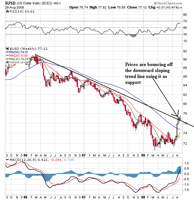
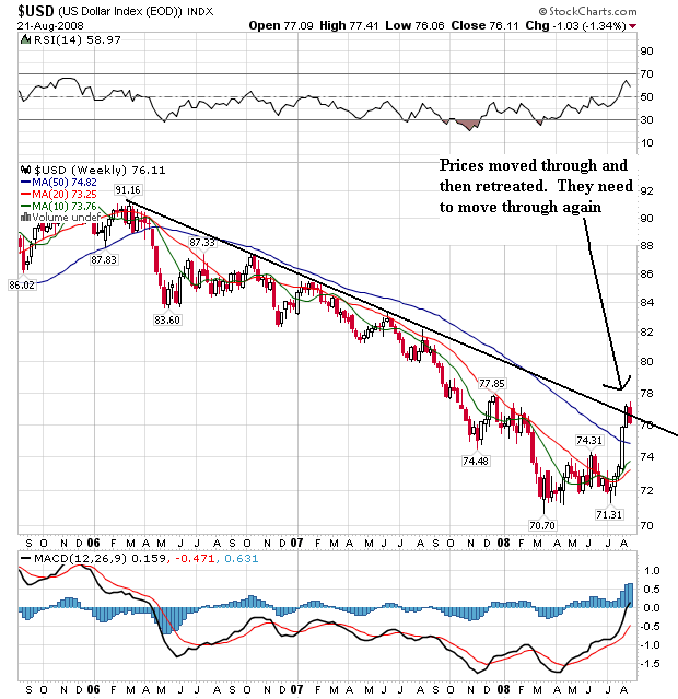
On the long-term chart, notice the following:
-- Prices have moved above the long-term downward sloping trend line that started over two years ago. This is a major break and signals a big change in the dollar market. Also notice prices are consolidating recently made gains by bouncing off the trend line and using it as support. Both of these developments are technically important and indicate a trend reversal may be in play
-- Also note the 10 and 20 week SMA are now moving higher. These are also important developments. Weekly SMAs take longer to change direction. As a result, when they do change direction it's important to take note.
-- Prices are about the 10, 20 and 50 week SMA. This will continue to pull these numbers higher which is another long-term bullish indicator.
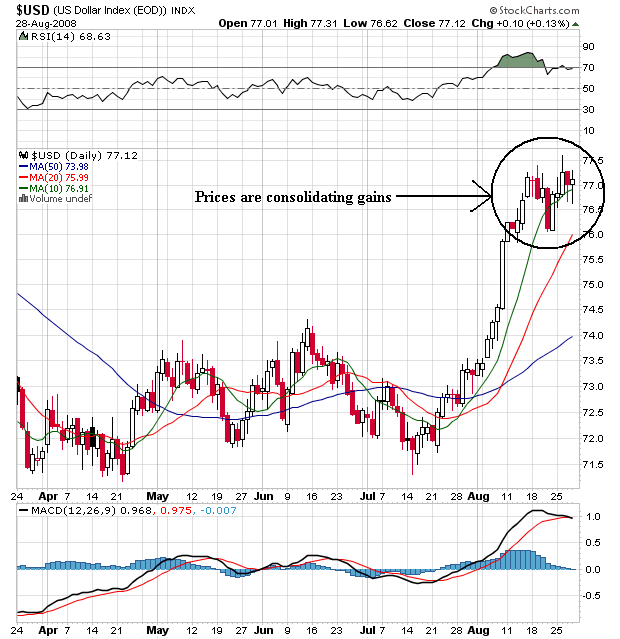
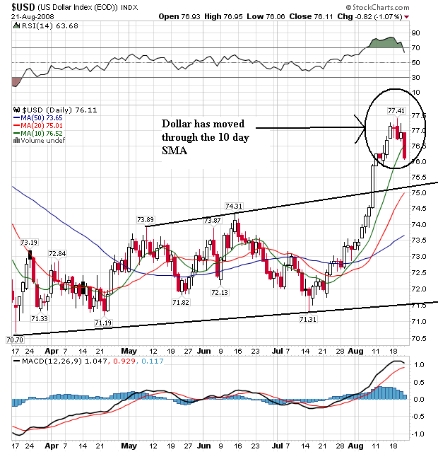
On the weekly chart, notice the following:
-- The SMAs are aligned very bullishly. The shorter SMAs are above the longer SMAs and all the SMAs are moving higher.
-- Prices are above the SMAs, which will pull these numbers higher
-- Prices are currently using the 10 day SMA as technical support
This is a bullish chart, although I would not be surprised to see a pullback to the 20 day SMA.
Thursday, August 28, 2008
Today's Markets
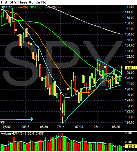
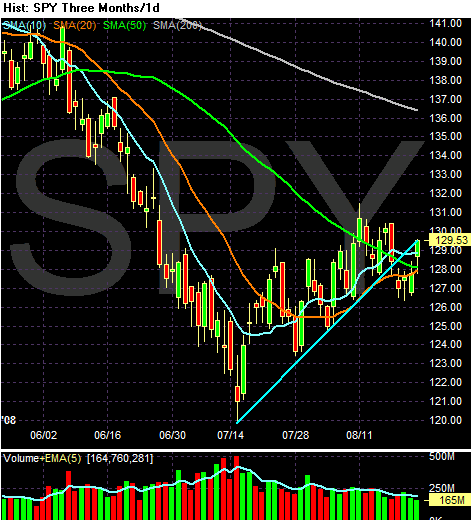
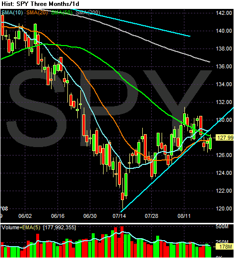
I'm loathe to call today's price action a break-out, only because the SMAs are such a mess. However, prices did move above the upper trendline of the triangle consolidation of the SPYs that started a little after the first of August. That being said, this index is still a mess and could go either way. Note the following:
-- Prices are below the 200 day SMA
-- The 200 and 50 day SMA are both moving lower. Therefore, the long-term trends are down.
BUT
-- The 20 day SMA is moving higher, and
-- the 10 day SMA has made a move to at least think about moving higher in the short run
-- Prices are above all the SMAs
Simply put, there are a lot of conflicting signals in the market right now.
GDP +3.3%
From the BEA:
Before we all get really excited about this, let's take a look at how we get the 3.3% number.
The GDP number is the end result of the following sub-areas.
Personal consumption expenditures: these are responsible for 1.24 of the 3.3% increase or 37.57% of the total. However, let's remember we had the government stimulus checks hit the economy last quarter. Without the stimulus checks, personal income growth would have been stagnant.
Gross Private Domestic Investment: this category was responsible for -1.82 of the 3.3 growth figure. In other words, this category completely eliminated any growth from personal consumption expenditures (which were also rigged higher by stimulus checks). So after these two figures, we have a net change -.58
Exports: This was the big reason for the change in the number. Exports were responsible for 3.10 of the increase -- or 93% of the 3.3% change. When we look a bit deeper into these numbers, we see that exports rose 13%. That's good. But imports dropped 7.6%. That's one of the biggest drops in a long time and indicates demand is dropping in the US. That's not good.
Government expenditures: are responsible for .76 of the 3.3 number or 23% if the increase. When government spending is responsible for nearly 25% of your GDP growth, you have big problems.
On the domestic side, we have an increase in consumer spending that was juiced with government stimulus. Domestic investment subtracted from growth.
On the trade side, a big drop in imports led to a larger increase in exports.
In other words, the great growth rate is the result of a mathematical construct, not solid growth.
Real gross domestic product -- the output of goods and services produced by labor and property located in the United States -- increased at an annual rate of 3.3 percent in the second quarter of 2008,(that is, from the first quarter to the second quarter), according to preliminary estimates released by the Bureau of Economic Analysis. In the first quarter, real GDP increased 0.9 percent.
Before we all get really excited about this, let's take a look at how we get the 3.3% number.
The GDP number is the end result of the following sub-areas.
Personal consumption expenditures: these are responsible for 1.24 of the 3.3% increase or 37.57% of the total. However, let's remember we had the government stimulus checks hit the economy last quarter. Without the stimulus checks, personal income growth would have been stagnant.
Gross Private Domestic Investment: this category was responsible for -1.82 of the 3.3 growth figure. In other words, this category completely eliminated any growth from personal consumption expenditures (which were also rigged higher by stimulus checks). So after these two figures, we have a net change -.58
Exports: This was the big reason for the change in the number. Exports were responsible for 3.10 of the increase -- or 93% of the 3.3% change. When we look a bit deeper into these numbers, we see that exports rose 13%. That's good. But imports dropped 7.6%. That's one of the biggest drops in a long time and indicates demand is dropping in the US. That's not good.
Government expenditures: are responsible for .76 of the 3.3 number or 23% if the increase. When government spending is responsible for nearly 25% of your GDP growth, you have big problems.
On the domestic side, we have an increase in consumer spending that was juiced with government stimulus. Domestic investment subtracted from growth.
On the trade side, a big drop in imports led to a larger increase in exports.
In other words, the great growth rate is the result of a mathematical construct, not solid growth.
Thursday Oil Market Round-Up
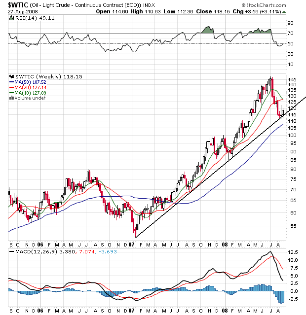
On the long-term chart, notice the following:
-- Prices are resting on the long-term trend line. That means despite everybody being thrilled about lower oil prices, the uptrend that started a little over a year ago is still in place and can be resumed at any time.
-- The 10 week SMA is about to move through the 20 week SMA. Because this is a weekly SMA it takes longer to move. However, that makes a move that much more significant.
-- Prices are below the 10 and 20 week SMAs, which will keep these SMAs under downward pressure.
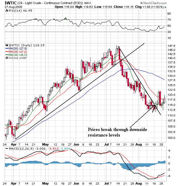
On the daily chart, notice the following:
-- Prices have broken through the downward sloping trend line established at the beginning of the correction, indicating a trend reversal.
-- The 10 day SMA is turning the corner and will cross over the 20 day SMA
-- Prices are trying to move above the 10 and 20 week SMA, although they are not there yet.
Wednesday, August 27, 2008
Today's Markets
The market is a mess right now; there is no clear direction one way or the other. Note the following:
-- Prices and SMAs are bunched together within one point of each other
-- The The 10 and 50 SMA are headed lower, but
-- The 20 day SMA is headed higher
-- Prices are below the 200 day SMA
-- Prices broke through the support of the trend line that started in mid-July, but haven't made a strong move in either direction ever since they broke through.
Financial Sector Is Still Deteriorating
From the FDIC:
Let's take this piece by piece
An old rule of writing is, "tell them what you're going to tell them, tell them, and then tell them what you told them." This is the opening line -- and it is terrible. We know nothing good is coming.
Earnings are down -- big time. This is the second lowest net income we've seen since 1991 -- that's over 15 years. In addition, earnings are dropping hard on a year over year basis, indicating the problems are not getting better but are getting worse.
The biggest reason things are getting worse is banks are preparing for higher losses from more bad loans. Loan loss provisions are increasing four-fold. That's a tremendous increase.
33% of the industry's second quarter revenue went to loan loss reserves. That's the most since the end of the S&L crisis.
Put another way -- banks are barely making any money on any of their assets.
The losses (and subsequently the problems) within the insured bank industry are wide-spread.
Let's look at some pertinent charts from the report:
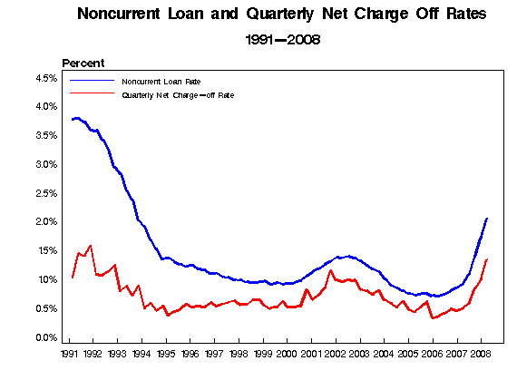
The non-current loan and charge off rate is higher than at any time in the last 14 years. And the number is clearly increasing, indicating we're nowhere near the end of this.
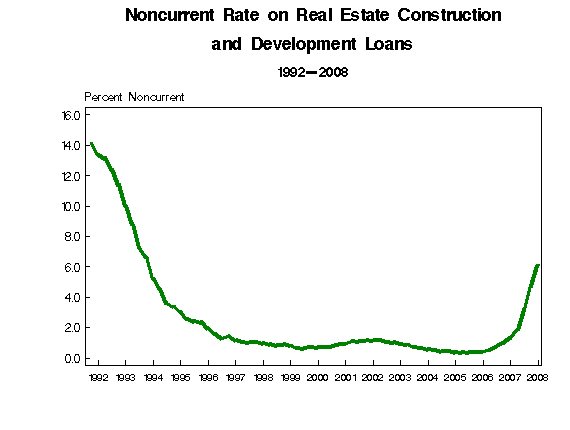
Real estate loans are a big reason for the problems. People are defaulting in droves. Again -- the number is increasing, indicating we're nowhere near the bottom of this.
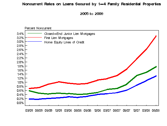
The default rate on home loans is increasing as well.
And that's not all:
As a result:
None of this should be surprising.
Let's tie all of this together.
The charts from the latest QBP indicate the trend in real estate related loans is or further deterioration. As a result, we can expect the FDIC's list of problem banks to grow, which will force the FDIC to ask the Treasury for more money. This at a time when the Treasury has been given an unfettered line of credit to pump into Fannie and Freddie.
The Treasury will be writing an awful lot of checks in the coming quarters.
The continued downturn in the credit cycle, combined with lingering weakness in financial markets and falling asset values, had a pronounced negative effect on banking industry performance in the second quarter. Insured commercial banks and savings institutions reported net income of $5.0 billion for the second quarter of 2008. This is the second-lowest quarterly total since 1991 and is $31.8 billion (86.5 percent) less than the industry earned in the second quarter of 2007. Higher loan-loss provisions were the most significant factor in the earnings decline. Loss provisions totaled $50.2 billion, more than four times the $11.4 billion quarterly total of a year ago. Second-quarter provisions absorbed almost one-third (31.9 percent) of the industry's net operating revenue (net interest income plus total noninterest income), the highest proportion since the third quarter of 1989. A year ago, provisions absorbed only 7.3 percent of industry revenue. The average return on assets (ROA) in the second quarter was 0.15 percent, compared to 1.21 percent a year earlier. Large institutions as a group had more substantial earnings erosion than smaller institutions, but downward earnings pressure was widely evident across the industry. At institutions with assets greater than $1 billion, the average ROA in the second quarter was 0.10 percent, down from 1.23 percent a year ago. At institutions with less than $1 billion in assets, the average second-quarter ROA was 0.57 percent, compared to 1.10 percent in the second quarter of 2007. More than half of all insured institutions (56.4 percent) reported year-over-year declines in quarterly net income, and almost two out of every three institutions (62.1 percent) reported lower ROAs. Almost 18 percent of all insured institutions were unprofitable in the second quarter, compared to only 9.8 percent in the second quarter of 2007.
Let's take this piece by piece
The continued downturn in the credit cycle, combined with lingering weakness in financial markets and falling asset values, had a pronounced negative effect on banking industry performance in the second quarter.
An old rule of writing is, "tell them what you're going to tell them, tell them, and then tell them what you told them." This is the opening line -- and it is terrible. We know nothing good is coming.
Insured commercial banks and savings institutions reported net income of $5.0 billion for the second quarter of 2008. This is the second-lowest quarterly total since 1991 and is $31.8 billion (86.5 percent) less than the industry earned in the second quarter of 2007.
Earnings are down -- big time. This is the second lowest net income we've seen since 1991 -- that's over 15 years. In addition, earnings are dropping hard on a year over year basis, indicating the problems are not getting better but are getting worse.
Higher loan-loss provisions were the most significant factor in the earnings decline. Loss provisions totaled $50.2 billion, more than four times the $11.4 billion quarterly total of a year ago
The biggest reason things are getting worse is banks are preparing for higher losses from more bad loans. Loan loss provisions are increasing four-fold. That's a tremendous increase.
Second-quarter provisions absorbed almost one-third (31.9 percent) of the industry's net operating revenue (net interest income plus total noninterest income), the highest proportion since the third quarter of 1989. A year ago, provisions absorbed only 7.3 percent of industry revenue.
33% of the industry's second quarter revenue went to loan loss reserves. That's the most since the end of the S&L crisis.
The average return on assets (ROA) in the second quarter was 0.15 percent, compared to 1.21 percent a year earlier.
Put another way -- banks are barely making any money on any of their assets.
More than half of all insured institutions (56.4 percent) reported year-over-year declines in quarterly net income, and almost two out of every three institutions (62.1 percent) reported lower ROAs.
The losses (and subsequently the problems) within the insured bank industry are wide-spread.
Let's look at some pertinent charts from the report:
The non-current loan and charge off rate is higher than at any time in the last 14 years. And the number is clearly increasing, indicating we're nowhere near the end of this.
Real estate loans are a big reason for the problems. People are defaulting in droves. Again -- the number is increasing, indicating we're nowhere near the bottom of this.
The default rate on home loans is increasing as well.
And that's not all:
The U.S. Federal Deposit Insurance Corp. said its ``problem list'' of banks increased 30 percent in the second quarter to the highest total in five years as more commercial real-estate loans were overdue.
The list had 117 banks as of June 30, up from 90 in the first quarter and the highest since mid-2003, the agency said today in its quarterly report without naming any institutions. FDIC-insured lenders reported net income of $4.96 billion, down 87 percent from $36.8 billion in the same quarter a year ago.
``More banks will come on the list as credit problems worsen,'' FDIC Chairman Sheila Bair said at a news conference in Washington.
As a result:
Federal Deposit Insurance Corp. Chairman Sheila Bair said Tuesday her agency might have to borrow money from the Treasury Department to see it through an expected wave of bank failures.
Ms. Bair said the borrowing could be needed to cover short-term cash-flow pressures caused by reimbursing depositors immediately after the failure of a bank. The borrowed money would be repaid once the assets of that failed bank are sold.
The last time the FDIC borrowed funds from Treasury came at the tail end of the savings-and-loan crisis in the early 1990s after thousands of banks were shuttered. That the agency is considering the option again, after the collapse of just nine banks this year, illustrates the concern among Washington regulators about the weakness of the U.S. banking system in the wake of the credit crisis.
None of this should be surprising.
Let's tie all of this together.
The charts from the latest QBP indicate the trend in real estate related loans is or further deterioration. As a result, we can expect the FDIC's list of problem banks to grow, which will force the FDIC to ask the Treasury for more money. This at a time when the Treasury has been given an unfettered line of credit to pump into Fannie and Freddie.
The Treasury will be writing an awful lot of checks in the coming quarters.
We're Nowhere Near A Bottom in Housing
From the WSJ:
Let's take this in pieces.
First, year over year prices are dropping big. In fact, this is the largest year over year drop on record. The good news is prices are in fact dropping. For a long time, home prices were very sticky, meaning they were not moving in reaction to a market that was clearly in need of lower prices. Now prices are moving lower. But once prices start moving lower, there is no way to stop them from dropping until they hit the market clearing price. The rate of the drop indicates we're nowhere near a bottom yet. When we start to see a slowdown in the rate of year over year change, then we'll know a bottom is approaching.
Regarding existing homes, note the following:
Although prices are dropping, inventory is still climbing to record levels. That means we're nowhere near the market clearing price. Therefore, the existing home market is still headed lower for the foreseeable future.
Regarding new homes, the good news is that inventory has been dropping for over a year now. However, the months of supply at current sales rates is still near historically high levels, indicating we have a ways to go on the possible bottom there as well.
And this is before we get into the whole banking thing (which we'll look at in the next post).
But prices are still much lower than they were a year ago. Home prices in 10 major metropolitan areas in June fell 17% from the year before, though the declines appear to be moderating. The broader 20-city index showed similar patterns. A separate gauge of home prices by the Office of Federal Housing Enterprise Oversight, which covers more of the country but only tracks mortgages backed by Fannie Mae and Freddie Mac, found home prices were unchanged in June from the month before.
.....
Sales of new homes rose by 2.4% in July to a seasonally adjusted annual rate of 515,000 units after falling to a revised, 17-year low in June, the Commerce Department said Tuesday. The inventory of unsold homes declined for the second month in a row, to 10.1 months' supply at the current sales pace. Still, the number of unsold homes remains at historically high levels.
"There's still a big overhang of homes on the market that need to clear," said Lehman Brothers economist Michelle Meyer.
.....
On Monday, the National Association of Realtors reported that there was an 11.2 months' supply of previously-owned homes for sale last month, compared to about a six-month supply that usually accompanies healthy housing markets. Sales of previously-owned homes make up about 85% of the market and have been hampered by a flood of foreclosed properties that's expected to continue through next year.
Let's take this in pieces.
First, year over year prices are dropping big. In fact, this is the largest year over year drop on record. The good news is prices are in fact dropping. For a long time, home prices were very sticky, meaning they were not moving in reaction to a market that was clearly in need of lower prices. Now prices are moving lower. But once prices start moving lower, there is no way to stop them from dropping until they hit the market clearing price. The rate of the drop indicates we're nowhere near a bottom yet. When we start to see a slowdown in the rate of year over year change, then we'll know a bottom is approaching.
Regarding existing homes, note the following:
The median national home price declined 7.1 percent from a year ago to $212,400 and the inventory of homes for sale rose to 4.67 million which would take 11.2 months to clear at the current sales pace. That matched a record set in April.
Although prices are dropping, inventory is still climbing to record levels. That means we're nowhere near the market clearing price. Therefore, the existing home market is still headed lower for the foreseeable future.
Regarding new homes, the good news is that inventory has been dropping for over a year now. However, the months of supply at current sales rates is still near historically high levels, indicating we have a ways to go on the possible bottom there as well.
And this is before we get into the whole banking thing (which we'll look at in the next post).
Wednesday Commodities Round-Up
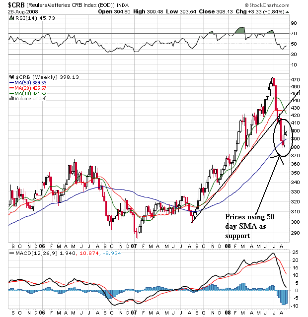
Starting at the end of last summer, the commodities index started rallying. The rally lasted about a year. Prices would rally, sell-off and then rally again. Prices used the 10 and 20 day SMAs as their primary support. However, prices broke through support in July and are now below the upward sloping trend line of the rally started at the end of summer 2007. Prices have moved through the 10 and 20 week SMA, but have bounced off the 50 week SMA for now.
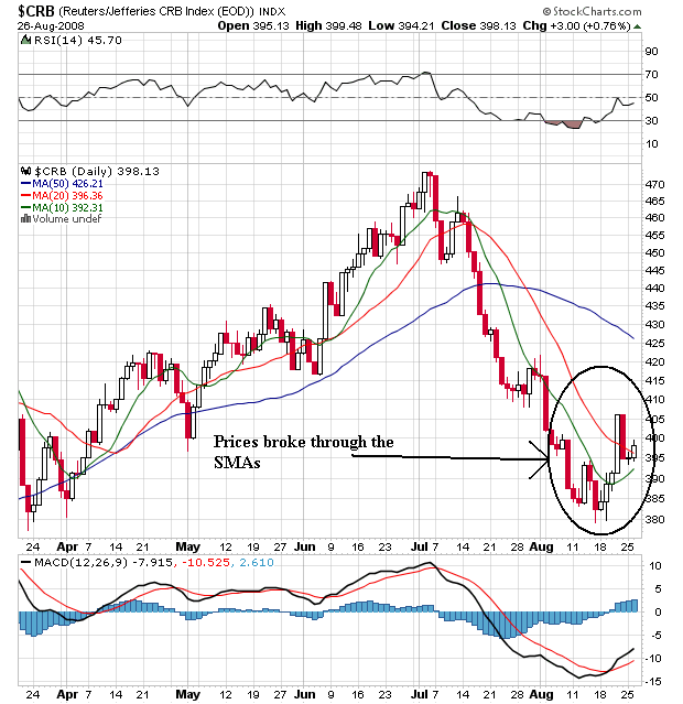
On the daily chart, notice the following:
-- The 20 and 50 day SMA are still heading lower
-- the 10 day SMA is moving higher
-- Prices have moved through the 10 and 20 day SMA
-- Prices are currently using the 20 day SMA as technical support
This is a chart in transition. My guess is we're going to see a sideways consolidation that will form either a rectangle or triangle consolidation pattern.
Tuesday, August 26, 2008
Treasury Tuesdays
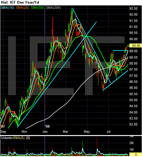
Let's look at the macro-picture to see where we are in the cycle. The IEF (7-10 year Treasury) started to rally at the end of last summer in reaction to the credit crunch starting -- traders/investors were looking for a safe place to put their money. The IEF rallied until the Fed back-stopped the Bear Stearns deal. Then traders realized the Fed would be extremely active and as a result Treasuries were less attractive. Treasuries sold-off until the end of June.
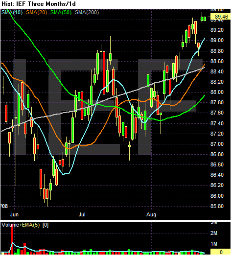
Which brings us to the three month chart. Notice th following:
-- Prices are above the 200 day SMA
-- The 10 and 20 day SMA have crossed over the 200 day SMA
-- The 10, 20, and 50 day SMA are all moving higher
-- Prices have moved through previous upside resistance.
This is looking like a market that wants to rally.
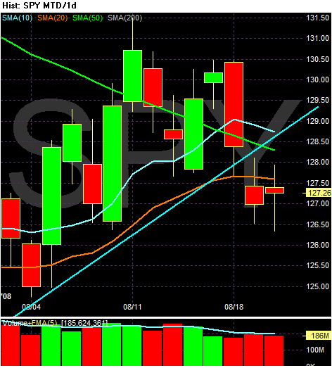
Monday, August 25, 2008
Today's Markets
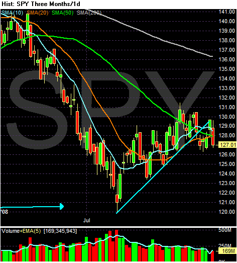
Notice the following:
-- Prices fell through all the SMAs today
-- Prices rebounded from the trend line started in mid-July
The big issue will be if prices hold about 126.50 or so -- that's an incredibly important technical level.
We're Nowhere Near A Bottom in Housing
From CNBC:
Let's think about these numbers.
Sales increased month to month, but decreased from last year. That means we're still on a downward trajectory in the longer-term.
Prices dropped 7.1%. In the long run this is good because houses are way too expensive right now. That's what happens in a price bubble -- prices move higher than they should, so they have farther to fall on the downside.
The record inventory is the really scary number. Prices are dropping yet inventory is increasing. That means we're nowhere near equilibrium price.
The National Association of Realtors reported sales rose to a seasonally adjusted annual rate of 5 million units. Sales had been expected to rise by only 1.6 percent, according to economists surveyed by Thomson/IFR.
Still, home sales were 13.2 percent lower than a year ago.
The median price for a home sold in July dropped to $212,000, down by 7.1 percent from a year ago.
The inventory of homes for sale rose to a record 4.67 million homes or a 11.2 months' supply at the current sales pace, matching a record set in April.
Let's think about these numbers.
Sales increased month to month, but decreased from last year. That means we're still on a downward trajectory in the longer-term.
Prices dropped 7.1%. In the long run this is good because houses are way too expensive right now. That's what happens in a price bubble -- prices move higher than they should, so they have farther to fall on the downside.
The record inventory is the really scary number. Prices are dropping yet inventory is increasing. That means we're nowhere near equilibrium price.
Both Tax Plans Will Add to the Deficit -- And Our Problems
From the Tax Policy Center:
For those of you who are unfamiliar with the Tax Policy Center, it is a joint effort by the Brookings Institution and Urban Institute. They have consistently done very good policy work.
Now -- here are some basic overviews of the individual plans.
Despite not working as advertised under Reagan and Bush II, McCain is adopting a supply side cut of corporate taxes from 35% to 25%, and making all cuts from 2001 and 2003 permanent. He would lower the estate tax to 15% with a $5 million dollar exemption.
The end result of both plans is a loss of revenue for the years 2009 - 2013 of $1.4 trillion under McCain and a loss of $966.7 billion under Obama.
Here's the basic problem with the plans. No one is talking about specific spending cuts. And spending has really increased over the last 8 years. According to the Congressional Budget Office discretionary spending totaled $649 billion in 2001 and $1.041 trillion in 2007 for an increase of 60%. At the same time revenue increased from $1.9 trillion to $2.5 trillion -- an increase of 31%. As a result, the US government has issued over $500 billion dollars of net new debt per year since 2003:
09/30/2007 $9,007,653,372,262.48
09/30/2006 $8,506,973,899,215.23
09/30/2005 $7,932,709,661,723.50
09/30/2004 $7,379,052,696,330.32
09/30/2003 $6,783,231,062,743.62
09/30/2002 $6,228,235,965,597.16
09/30/2001 $5,807,463,412,200.06
09/30/2000 $5,674,178,209,886.86
Total debt outstanding is now $9,618,645,199,394.09.
The Republicans fiscally jumped the shark a long time ago. Under Reagan we saw debt balloon from a little over 30% of GDP to a little over 60% of GDP. Under Bush II we've seen the total increase from about 57%/GDP to about 64%/GDP, yet they continue to push their "supply side" theory under the psychotic belief that repeating a behavior proven not to work will somehow work if they just try it again. In addition, no Republican administration has come close to balancing a budget in the last 25 years. So please -- if you're a Republican and you believe the supply-side garbage (along with the statement that Republicans are "fiscally responsible") please -- just don't talk. I have better things to listen to.
However, the Democrats are beginning to move into dangerous ground as well. Clinton balanced the budget in 8 years, yet he is still pilloried for his other problems. Then the Republicans came into power and they spent more money on their constituency then anyone thought was possible. Now the Democrats want their turn at Washington's feeding trough. To that end, we've seen an increasing justification for massive Washington spending. Add to that an economy in a recession with little possibility of solid growth ahead and the impetus to spend big increases.
The problem with this theory is the dollar. Here is a 30 year chart of the dollar:
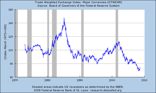
Notice the dollar is near its lowest level in 30 years. Also notice the dollar dropped in value during the latest expansion, which is extremely odd behavior. When an economy is expanding the country's currency should increase because a growing economy attracts investors which in turn should bid up the country's currency. But the dollar fell. The primary reason for the drop was the US economy was issuing debt like it was going out of style, indicating the possibility of the US actually paying back its debt was decreasing, which in turn makes the US dollar less attractive. This has led to a host of problems, not the least of which is spiking commodity prices. Because commodities are priced in dollars, a drop in the dollar is a de facto increase in commodity prices. A long-term drop in the dollar is an invitation to inflationary pressures that hurt everyone (been to the gas station lately?).
The point to all of this is the US can't go on a major spending spree right now without seriously risking the dollar dropping further leading to another round of commodity price spikes. It may be that the dollar doesn't drop. But the possibility of the dollar dropping more is pretty high.
As a result, it is imperative for Washington to get the national checkbook under control. We've spent the last 8 years not making tough choices that need to be made. Now we have two presidential hopefuls who would continue that trend. If this trend continues, the market will make our choice for us by sending the dollar lower and spiking commodities further. And that is something no one wants in any way shape or form.
Both John McCain and Barack Obama have proposed tax plans that would substantially increase the national debt over the next ten years, according to a newly updated analysis by the non-partisan Tax Policy Center. Compared to current law, TPC estimates the Obama plan would cut taxes by $2.9 trillion from 2009-2018. McCain would reduce taxes by nearly $4.2 trillion. Obama would give larger tax cuts to low- and moderate-income households and pay some of the cost by raising taxes on high-income taxpayers. In contrast, McCain would cut taxes across the board and give the biggest cuts to the highest-income households.
.....
Neither candidate's plan would significantly increase economic growth unless offset by spending cuts or tax increases that the campaigns have not specified.
For those of you who are unfamiliar with the Tax Policy Center, it is a joint effort by the Brookings Institution and Urban Institute. They have consistently done very good policy work.
Now -- here are some basic overviews of the individual plans.
Despite not working as advertised under Reagan and Bush II, McCain is adopting a supply side cut of corporate taxes from 35% to 25%, and making all cuts from 2001 and 2003 permanent. He would lower the estate tax to 15% with a $5 million dollar exemption.
The Obama plan would reduce taxes for low and moderate income families, but raise them significantly for high-bracket taxpayers. By 2012, middle-income taxpayers would see their after-tax income rise by about 5%...Those in the top 1% would face a....1.5% reduction in after tax income.
The end result of both plans is a loss of revenue for the years 2009 - 2013 of $1.4 trillion under McCain and a loss of $966.7 billion under Obama.
Here's the basic problem with the plans. No one is talking about specific spending cuts. And spending has really increased over the last 8 years. According to the Congressional Budget Office discretionary spending totaled $649 billion in 2001 and $1.041 trillion in 2007 for an increase of 60%. At the same time revenue increased from $1.9 trillion to $2.5 trillion -- an increase of 31%. As a result, the US government has issued over $500 billion dollars of net new debt per year since 2003:
09/30/2007 $9,007,653,372,262.48
09/30/2006 $8,506,973,899,215.23
09/30/2005 $7,932,709,661,723.50
09/30/2004 $7,379,052,696,330.32
09/30/2003 $6,783,231,062,743.62
09/30/2002 $6,228,235,965,597.16
09/30/2001 $5,807,463,412,200.06
09/30/2000 $5,674,178,209,886.86
Total debt outstanding is now $9,618,645,199,394.09.
The Republicans fiscally jumped the shark a long time ago. Under Reagan we saw debt balloon from a little over 30% of GDP to a little over 60% of GDP. Under Bush II we've seen the total increase from about 57%/GDP to about 64%/GDP, yet they continue to push their "supply side" theory under the psychotic belief that repeating a behavior proven not to work will somehow work if they just try it again. In addition, no Republican administration has come close to balancing a budget in the last 25 years. So please -- if you're a Republican and you believe the supply-side garbage (along with the statement that Republicans are "fiscally responsible") please -- just don't talk. I have better things to listen to.
However, the Democrats are beginning to move into dangerous ground as well. Clinton balanced the budget in 8 years, yet he is still pilloried for his other problems. Then the Republicans came into power and they spent more money on their constituency then anyone thought was possible. Now the Democrats want their turn at Washington's feeding trough. To that end, we've seen an increasing justification for massive Washington spending. Add to that an economy in a recession with little possibility of solid growth ahead and the impetus to spend big increases.
The problem with this theory is the dollar. Here is a 30 year chart of the dollar:
Notice the dollar is near its lowest level in 30 years. Also notice the dollar dropped in value during the latest expansion, which is extremely odd behavior. When an economy is expanding the country's currency should increase because a growing economy attracts investors which in turn should bid up the country's currency. But the dollar fell. The primary reason for the drop was the US economy was issuing debt like it was going out of style, indicating the possibility of the US actually paying back its debt was decreasing, which in turn makes the US dollar less attractive. This has led to a host of problems, not the least of which is spiking commodity prices. Because commodities are priced in dollars, a drop in the dollar is a de facto increase in commodity prices. A long-term drop in the dollar is an invitation to inflationary pressures that hurt everyone (been to the gas station lately?).
The point to all of this is the US can't go on a major spending spree right now without seriously risking the dollar dropping further leading to another round of commodity price spikes. It may be that the dollar doesn't drop. But the possibility of the dollar dropping more is pretty high.
As a result, it is imperative for Washington to get the national checkbook under control. We've spent the last 8 years not making tough choices that need to be made. Now we have two presidential hopefuls who would continue that trend. If this trend continues, the market will make our choice for us by sending the dollar lower and spiking commodities further. And that is something no one wants in any way shape or form.
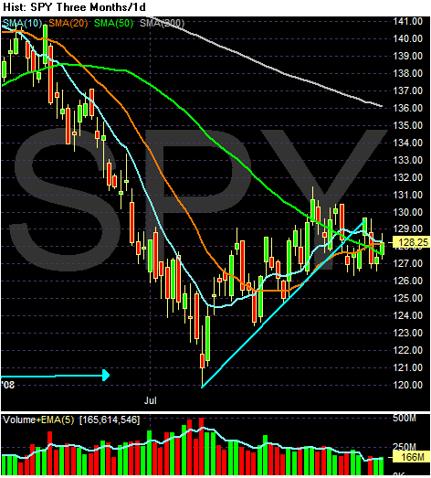
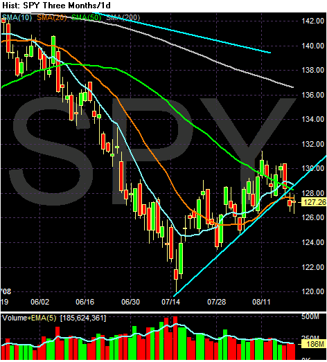
Market Mondays
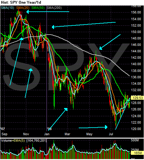
Let's start with the macro picture. Notice two important things about this year long chart in daily increments:
-- Prices are below the 200 day SMA and the 200 day SMA has acted as resistance since the end of last year
-- The index has made a series of lower lows and lowers highs which is a classic bear market pattern
On the three month chart, notice the following:
-- Prices dipped below all three SMAs last week, but have since rebounded
-- The 10 and 20 day SMAs are heading higher
-- The 10 and 20 day SMAs have moved through the 50 day SMA
-- The last two points are short-term bullish
-- The 50 and 200 day SMA are heading lower which is long-term bearish
So we have a split market -- a good short-term bullish bias and a long-term bearish bias. That makes the current rally very suspect in its possible longevity.
Friday, August 22, 2008
Weekend Weimar and Beagle
It's that time of the week. It's time to not think about the markets and move into anything else but the markets. To that end....

The Weimar and the Beagle are enjoying the new couch...
and

For some reason this is comfortable. I have no idea why. And yes, we are still moving in......three months later......
The Weimar and the Beagle are enjoying the new couch...
and
For some reason this is comfortable. I have no idea why. And yes, we are still moving in......three months later......
The Auto Bail-Outs Are Starting
From CNBC:
First -- I called this a few months ago. So allow me a blatant ego boost.
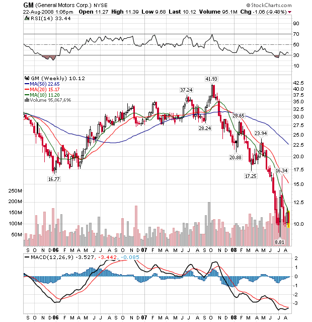
This shouldn't surprise anybody. Detroit has been losing money in a big way for awhile now. GM's latest earnings report was terrible:
From Bloomberg:
And the latest sales figures were equally bad:
From the AP:
Here's the real issue.
About 7 years ago, Toyota unveiled the Prius which has now sold 1 million cars. That's a company that is doing well. Honda, which got into trucks late in the game and still primarily relies on fuel efficient cars is doing well. Here are their charts:
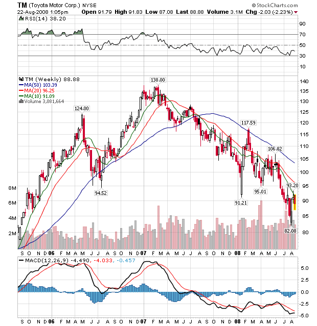
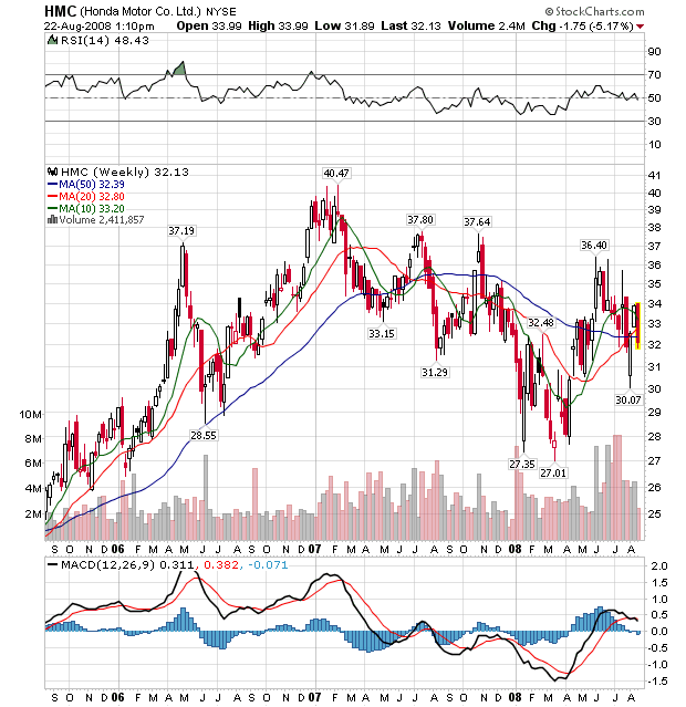
Not great, but certainly not terrible.
Ford and GM -- which make non-fuel efficient cars -- are a different story.
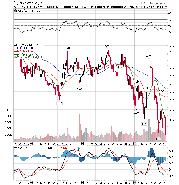
So -- make a terrible product and get a government loan for your mistakes.
Lobbyists for the U.S. automakers—General Motors, Ford Motor and Chrysler—briefed White House officials, as well as U.S. Rep. John Dingell and other Michigan Democrats, on a possible bailout and plan to unveil the proposal after Labor Day, according to the report.
The plan is for the government to lend some $25 billion to the automakers in the first year at an interest rate of 4.5 percent, or about one-third what the companies are currently paying to borrow, the report said.
First -- I called this a few months ago. So allow me a blatant ego boost.
This shouldn't surprise anybody. Detroit has been losing money in a big way for awhile now. GM's latest earnings report was terrible:
From Bloomberg:
General Motors Corp., the largest U.S. automaker, reported a second-quarter loss of $15.5 billion because of strains from truck leases, costs from labor disputes and plunging U.S. sales.
......
The mounting losses are siphoning resources Chief Executive Officer Rick Wagoner, 55, needs to develop fuel-saving cars to replace the pickup trucks and sport-utility vehicles being abandoned by U.S. buyers. Wagoner, now in his 9th year as CEO, won't project when GM will restore profit as he cuts costs by an additional $9 billion annually and carries out a plan to boost cash by as much as $17 billion.
``The trends that are out of their control, those are the things that have the potential to overwhelm them,'' Robert Schulz, a debt analyst at Standard & Poor's, said yesterday. He was referring to record gasoline prices that have transformed consumer behavior while a weakened U.S. economy drains auto sales to 15-year lows. ``We don't see the macro environment anywhere near on the mend,'' Schulz said.
.....
S&P yesterday cut GM's credit rating one level to B-, or six steps below investment grade, because falling U.S. sales are causing the automaker to use more cash than anticipated. With the U.S. auto slump expected to carry into next year, GM faces a risk of further cuts, Schulz said. GM had the highest rating, AAA, from 1953 until 1981.
And the latest sales figures were equally bad:
From the AP:
General Motors, Ford, Toyota and other automakers said Friday that their U.S. sales fell by double-digits. Nissan Motor Co. was the only major automaker to report a gain, with truck sales up 18 percent thanks in part to the new Rogue crossover and a boost in incentives. Nissan's overall sales rose 8.5 percent.
Automakers were expecting a slide in July as high gas prices continued to cut into sales of trucks and sport utility vehicles and new troubles in the auto leasing sector further wrecked consumers' confidence. July's seasonally adjusted sales rate -- which shows what sales would be if they continued at the same pace for the full year -- was 12.5 million vehicles, according to Autodata Corp. That's down from 17 million as recently as 2005.
Automakers expect things to get worse before they get better.
Here's the real issue.
About 7 years ago, Toyota unveiled the Prius which has now sold 1 million cars. That's a company that is doing well. Honda, which got into trucks late in the game and still primarily relies on fuel efficient cars is doing well. Here are their charts:
Not great, but certainly not terrible.
Ford and GM -- which make non-fuel efficient cars -- are a different story.
So -- make a terrible product and get a government loan for your mistakes.
Manufacturing Is Not Looking Good
From the NBER (on what they look for in order to date a recession):
We've had most of the industrial output information released for this month now (save for the Chicago index which comes out next week), so let's take a look at all the pieces to see what the result is.
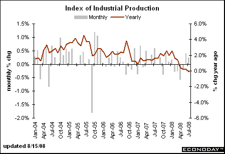
The year over year (YOY) change in industrial production has been dropping for the entire year. In addition, it's starting to move into negative territory on the chart, indicating a yearly contraction. This is a macro level statistic -- a statistic for the whole country. Therefore, it's safe to say the country's manufacturing sector at best treading water.
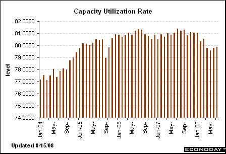
Although we've seen three months of increases, the longer-term industrial production trend is down indicating the country is using less and less of its overall industrial capacity. Overall, this is another bearish signal.
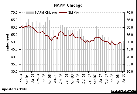
The Chicago area is treading water, with consistent readings right around the 50 area. In other words, the sector is hanging on, but barely.
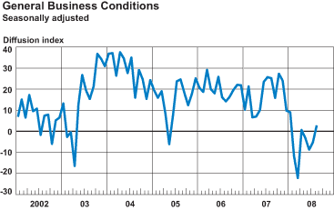
The New York are is not doing much better:
The Philly Fed isn't doing much better:
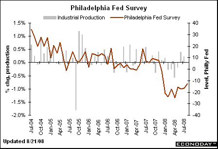
From the related report:
So, the bottom line is manufacturing is doing poorly (at best).
The committee places particular emphasis on two monthly measures of activity across the entire economy: (1) personal income less transfer payments, in real terms and (2) employment. In addition, we refer to two indicators with coverage primarily of manufacturing and goods: (3) industrial production and (4) the volume of sales of the manufacturing and wholesale-retail sectors adjusted for price changes.
We've had most of the industrial output information released for this month now (save for the Chicago index which comes out next week), so let's take a look at all the pieces to see what the result is.
The year over year (YOY) change in industrial production has been dropping for the entire year. In addition, it's starting to move into negative territory on the chart, indicating a yearly contraction. This is a macro level statistic -- a statistic for the whole country. Therefore, it's safe to say the country's manufacturing sector at best treading water.
Although we've seen three months of increases, the longer-term industrial production trend is down indicating the country is using less and less of its overall industrial capacity. Overall, this is another bearish signal.
The Chicago area is treading water, with consistent readings right around the 50 area. In other words, the sector is hanging on, but barely.
The New York are is not doing much better:
The general business conditions index, at 2.8, increased slightly from its July level of -4.9, indicating a marginal improvement in business conditions over the month. Roughly a quarter of respondents reported that conditions improved in August, while 23 percent reported that conditions had deteriorated. The new orders index, after increasing in July, fell slightly below zero to -2.2. The shipments index, in a similar pattern, gave up its July gains, falling to -0.9. The unfilled orders index held steady at -9.0, as did the delivery time index, at -3.4. The inventories index rose sharply after a steep decline last month, rising above zero to 5.6, its highest level in over a year.
The Philly Fed isn't doing much better:
From the related report:
The region's manufacturing sector remains weak, according to firms polled for the August Business Outlook Survey. Indexes for general activity, new orders, shipments, and employment were all negative again this month, although slightly higher than in July. Price pressures remain but were slightly less widespread compared to recent months. However, more than one-third of the firms continue to report higher prices for their own manufactured products. Most of the survey's future indicators moved higher this month, suggesting that the region's manufacturing executives believe growth in their sector will return over the next six months.
So, the bottom line is manufacturing is doing poorly (at best).
Forex Fridays --- The Dollar
On the weekly chart, notice the following:
-- The dollar broke through the downward sloping trend line that started at the beginning of 2006. That's a big development because it adds further evidence to the "trend reversal" argument. However, prices have fallen back through the line this week. It's possible we'll see prices gyrate around this very important level as traders decide how much higher they want to send the dollar. But for this to be a bona fide rally, the dollar must eventually move beyond this important technical indicator.
-- The 10 and 20 week SMA are both moving higher
-- The 10 week SMA crossed over the 20 week SMA
-- Remember the above two numbers are weekly numbers, so any change in trend is very important.
On the daily chart, notice the following:
-- All the SMAs are moving higher
-- The shorter SMAs are above the longer SMAs
-- Prices clearly broke through the upper trend line of the upward sloping trend channel.
BUT:
-- Prices have moved below the 10 day SMA in a fairly convincing fashion, indicating a short-term correction is probably underway. But corrections are standard in rallies, so it does not mean (in any way) that the rally is over.
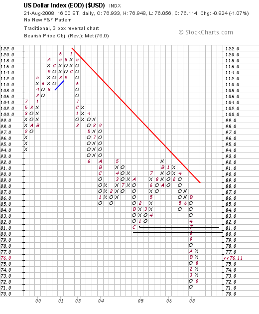
On the P&F chart, notice there is a great deal of resistance in the 80/81 area. That means there is plenty of upside room for prices to run at this point if they want to.
It's important to remember why the dollar is rallying right now. There are two fundamental reasons for people to buy a currency. Either the currency's interest rates are attractive relative to other currency's interest rates or the currency's economy is growing and therefore attractive for investment. The US does not have either fundamental development right now. From an interest rate perspective, notice the US' rates are not competitive compared to other rates:
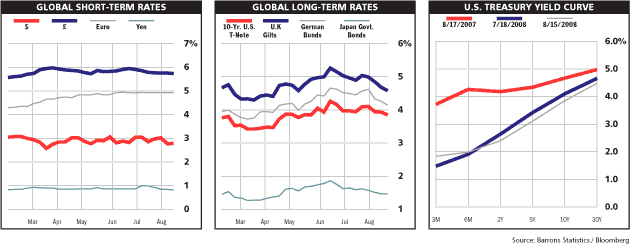
And the US economy is not in a strong position:
The Labor Department's weekly tally of claims for unemployment benefits shows joblessness is at recessionary levels, while the Conference Board's index of leading indicators, released Thursday, dropped sharply last month, suggesting economic conditions will weaken further this year.
"A few months ago, there was some discussion about a second-half recovery," said Ken Goldstein, an economist with the Conference Board, a business research group based in New York. Now, "if there's a second-half recovery, it'll be the second half of 2009."
So -- why is the dollar rallying?
It's not. Instead, the euro is dropping.
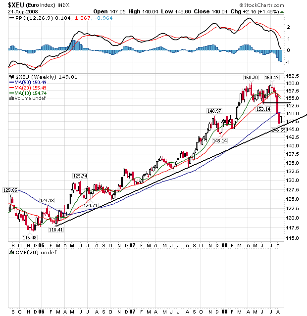
Notice the euro's chart is a mirror image of the dollar's chart. While the dollar has been dropping over the last two years, the euro has been the prime beneficiary of the drop. However, over the last few weeks, the euro has dropped about 7.8%, indicating there is a fundamental shift in the euro trade. That occurred when ECB President Trichet acknowledged the EU economy was weak and he might actually have to lower rates (or at least not raise them). In essence, be became an inflation dove overnight.
So -- we have a technical rally in the dollar caused by weakness in the euro, not strength in the US economy or higher US interest rates. As a result, the 80/81 price area on the dollar's PF chart looks like a really strong area of upside resistance to this rally.
Thursday, August 21, 2008
Today's Markets
Let's look at the macro environment to remember where we are:
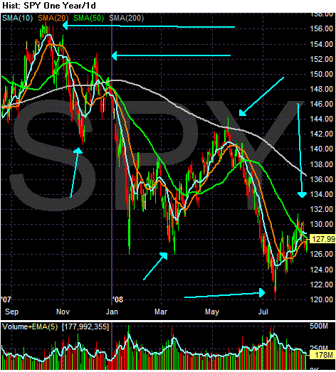
Since the end of last summer, the market has made a series of lower lows and lower highs -- a standard bear market formation.
On Monday, the market fell through the support line started in July. The market is consolidating below that line. Notice the following:
-- Prices ran into the 50 day SMA today and fell back
-- Prices moved through the 20 day SMA
-- Prices are still below the trend line started in July. The longer they stay below this level, the worse off the technical side of the market.
Let's Look A Bit Deeper Into the Future Inflation Picture
Over the last few weeks, I've noted that with oil coming down in price we should also expect a drop in inflation. Here are the relevant inflation charts:
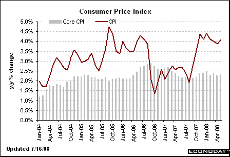
Y/O/Y inflation has remained stubbornly high for the last 6+ months
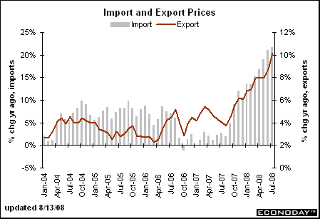
Import prices continue to rise, and
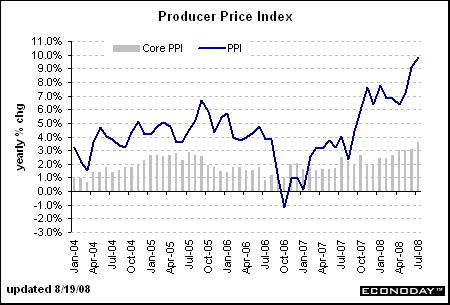
Producer prices continue to move higher as well.
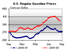
Reference oil's chart below for its recent price movement. Here is a chart of gas prices from This Week In Petroleum, which shows prices are already dropping at the retail level:
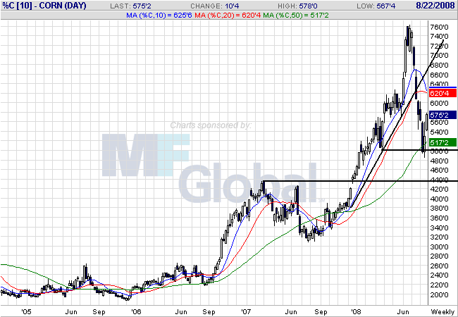
However, this may not be the case with agricultural prices. While we've seen some noticeable drops in several commodities like corn:
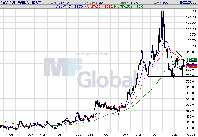
and wheat:
We're not need a commensurate drop in the overall price of agricultural prices:
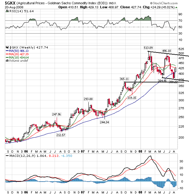
On the weekly agricultural price chart notice the following:
-- Prices have been moving sideways with a slightly downward bias since mid-Spring
-- Although prices dipped below the 50 week SMA a few weeks ago, they are now above that important technical indicator
-- Prices and the 10 and 20 week SMA are caught in a tight range, indicating an overall lack of direction in the market.
This is a chart that says consolidation with a possibility of downward movement.
At the retail level, agricultural prices are a bit more stubborn than gas prices:
These are interesting points, and ones I hadn't considered (largely because I didn't know about them). Basically, oil is a big part of gasoline but corn and wheat aren't as big part of the final food product. That means lower raw materials prices don't necessarily translate into lower final products prices.
Refer to the corn and wheat charts above. Note they are at very high levels even after coming down. Both wheat's and corn's price is more than double since 2006 which will have a negative impact on food prices.
But also consider this:
In other words, there is a longer cycle of food cost increases. It's similar to dropping a stone in a pond; some ripples don't appear for awhile.
Either way, this article has gotten me thinking about he future inflation picture and wondering whether the drop in commodity prices will lower prices at the retail level in a significant way.
Y/O/Y inflation has remained stubbornly high for the last 6+ months
Import prices continue to rise, and
Producer prices continue to move higher as well.
Reference oil's chart below for its recent price movement. Here is a chart of gas prices from This Week In Petroleum, which shows prices are already dropping at the retail level:
However, this may not be the case with agricultural prices. While we've seen some noticeable drops in several commodities like corn:
and wheat:
We're not need a commensurate drop in the overall price of agricultural prices:
On the weekly agricultural price chart notice the following:
-- Prices have been moving sideways with a slightly downward bias since mid-Spring
-- Although prices dipped below the 50 week SMA a few weeks ago, they are now above that important technical indicator
-- Prices and the 10 and 20 week SMA are caught in a tight range, indicating an overall lack of direction in the market.
This is a chart that says consolidation with a possibility of downward movement.
At the retail level, agricultural prices are a bit more stubborn than gas prices:
The economics of the food business are partly to blame. Though crude oil is the main ingredient of gasoline, processed foods like cereal, crackers or cookies use only a small amount of corn, wheat and other grains, limiting manufacturers' pricing power.
"Basically, there's only a few cents worth of corn in a box of corn flakes, so food prices are much slower to react to the downside than energy prices, " said Richard Feltes, senior vice president and director of commodity research for MF Global in Chicago.
Another factor keeping food prices high: Though commodities prices have fallen from record levels, they're still well above historical levels. Corn and soybeans have dropped 24 percent and 17 percent, respectively, in the last two months but are still about double where they were two years ago.
These are interesting points, and ones I hadn't considered (largely because I didn't know about them). Basically, oil is a big part of gasoline but corn and wheat aren't as big part of the final food product. That means lower raw materials prices don't necessarily translate into lower final products prices.
Refer to the corn and wheat charts above. Note they are at very high levels even after coming down. Both wheat's and corn's price is more than double since 2006 which will have a negative impact on food prices.
But also consider this:
Looking ahead to next year, economists see a mixed bag for American consumers. While falling grain prices should slow the rate of increases for baked goods, the USDA's Leibtag says people can expect to pay more for other items like beef, pork and chicken.
That's because as grain markets took off, the cost of corn- and soybean-based animal feed skyrocketed. Now, livestock owners — who spend half or more of their production costs on feeding their animals — have had to thin the size of their herds and flocks to deal with the increases. Cow slaughter has jumped 22 percent over last year, while hog slaughter is up 10 percent.
Much of that meat has gone into freezers to handle excess supply, but as the inventory dwindles, livestock owners won't have the money to replenish their herds to meet demand.
"That's going to have some serious consequence at the retail level," said Jesse Sevcik, vice president of legislative affairs at the American Meat Institute. "The only thing left is for prices to go up."
Expensive animal feed has also battered poultry producers, who so far have resisted passing on those costs to consumers to safeguard chicken's image as a good value compared to ribeye steaks and pork chops. But that's about to change, said Bill Roenigk, senior vice president of the National Chicken Council.
"From a consumer standpoint, more and more of these feed costs are going to be passed on and that means higher prices at the supermarket," said Roenigk.
Falling grain prices have taken some
In other words, there is a longer cycle of food cost increases. It's similar to dropping a stone in a pond; some ripples don't appear for awhile.
Either way, this article has gotten me thinking about he future inflation picture and wondering whether the drop in commodity prices will lower prices at the retail level in a significant way.
Thursday Oil Market Round-Up
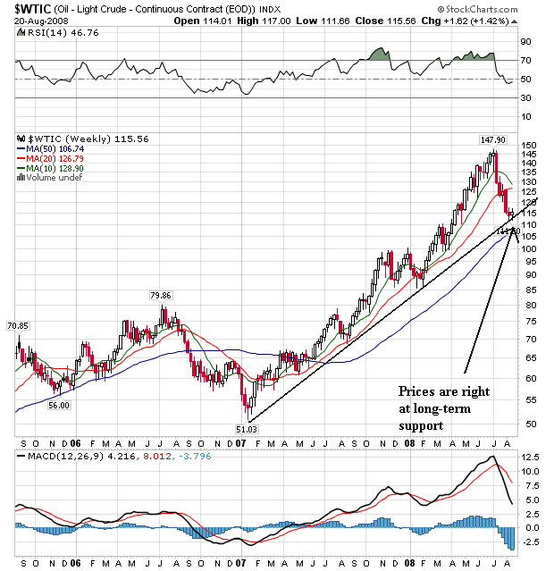
Let's start with the macro-view. The oil market started a rally in early 2007. Prices are now at that trend line started in early 2007. In addition, notice the following:
-- The 10 week SMA has turned lower and will probably cross the 20 week SMA within the next few weeks. This is the first time this has happened since 2006.
-- Prices are the farthest below the 20 week SMA in almost two years
On the daily chart, notice the following:
-- All the SMAs are headed lower
-- The shorter SMAs are below the longer SMAs
-- Prices are below the 20 and 50 day SMAa and are just above the 10 day SMA
-- Prices have broken through the downward sloping trend line started in mid-July
Bottom line: the market looks like it wants to either rally or consolidate sideways. Given the extreme over-sold position of the MACD and the failry oversold condition of the RSI, a rebound would not be unexpected. But this will run into the increasingly strong downward momentum from the downward sloping 10 week SMA. I think the best we can expect is some kind of short-term rally.
Wednesday, August 20, 2008
Today's Markets
On this chart, notice the following:
-- Prices are below all the SMAs
-- Prices are below the trend line that started in early July
-- The long-term SMAs (50 and 200) are both heading lower
-- The 10 day SMA has moved neutral
-- Prices are still below the 200 day SMA
Now -- let's look at the 1-month chart
Specifically notice the last two days. Note that prices have gotten over the 10 day SMA, but have not closed above that level. In addition note the lack of movement as indicated by the candles with small bodies. Traders are still trying to figure out where they want to go.
Fannie and Freddie Tumble
From Bloomberg:
What I find really interesting about this story is the blogs got it right from the very start while the main business press, well, didn't. I've gone over this before, but it's worth a second look. Fannie has about $40 million in equity. But they also have "long-term investments" totaling $650 million (and that's down from $787 million the previous quarter). Raise your hand if you think that portfolio is valued properly. Freddie has about $12 million in equity and a long-term portfolio at $760 million. Raise your...never mind. Freddie is one breath away from negative book value -- and Fannie isn't that far behind.
Let's go to the charts:
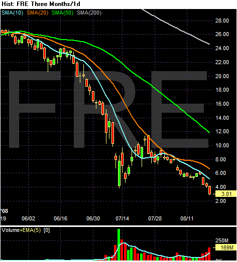
Notice the following:
-- Prices are below all the SMAs
-- All the SMAs are headed lower
-- The shorter SMAs are below the longer SMAs
-- Prices are below the 200 day SMA
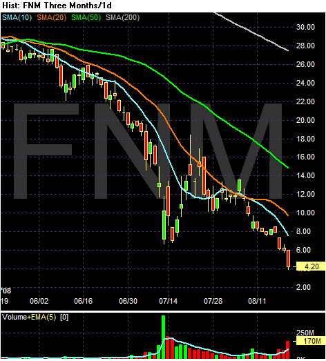
Notice the following:
-- Prices are below all the SMAs
-- All the SMAs are headed lower
-- The shorter SMAs are below the longer SMAs
-- Prices are below the 200 day SMA
These charts say on thing: bankruptcy.
Fannie Mae and Freddie Mac tumbled in New York trading to the lowest valuations since at least 1990 as speculation increased that the U.S. Treasury will bail out the mortgage-finance companies, wiping out shareholders.
Fannie, based in Washington, slumped as much as 20 percent and McLean, Virginia-based Freddie dropped as much as 32 percent, extending its losses to 90 percent for the year.
``Using taxpayer money to bail them out looks like it's becoming reality now,'' said Michael Nasto, the senior trader at U.S. Global Investors Inc., which manages $5 billion in San Antonio. ``That's going to leave the shareholders holding worthless paper.''
What I find really interesting about this story is the blogs got it right from the very start while the main business press, well, didn't. I've gone over this before, but it's worth a second look. Fannie has about $40 million in equity. But they also have "long-term investments" totaling $650 million (and that's down from $787 million the previous quarter). Raise your hand if you think that portfolio is valued properly. Freddie has about $12 million in equity and a long-term portfolio at $760 million. Raise your...never mind. Freddie is one breath away from negative book value -- and Fannie isn't that far behind.
Let's go to the charts:
Notice the following:
-- Prices are below all the SMAs
-- All the SMAs are headed lower
-- The shorter SMAs are below the longer SMAs
-- Prices are below the 200 day SMA
Notice the following:
-- Prices are below all the SMAs
-- All the SMAs are headed lower
-- The shorter SMAs are below the longer SMAs
-- Prices are below the 200 day SMA
These charts say on thing: bankruptcy.
A Closer Look At Gold
Considering this is Wednesday, let's take a look at the gold market. I use the gold market as an inflation proxy, meaning gold's price is a decent indicator of inflation expectations. To that end....
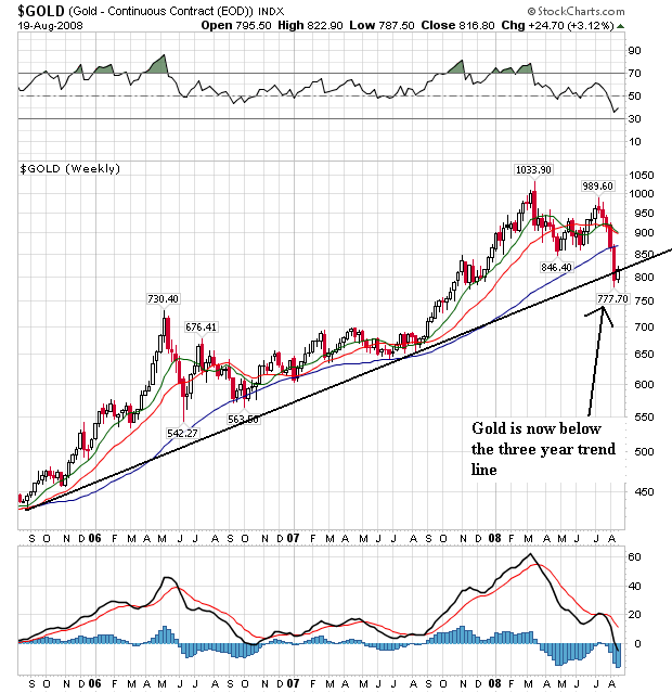
This is big news. The gold market has been rallying for the last three years. However, we now see that gold has broken below the three year trend line. This signals a reversal of trend. Also note this is the most liberal trend line available -- the trend line that connects the lowest lows of the last three years. Using a trend line that connects more of the bottoms yields this result:
In other words, no matter how you slice it, the trend has been changed.
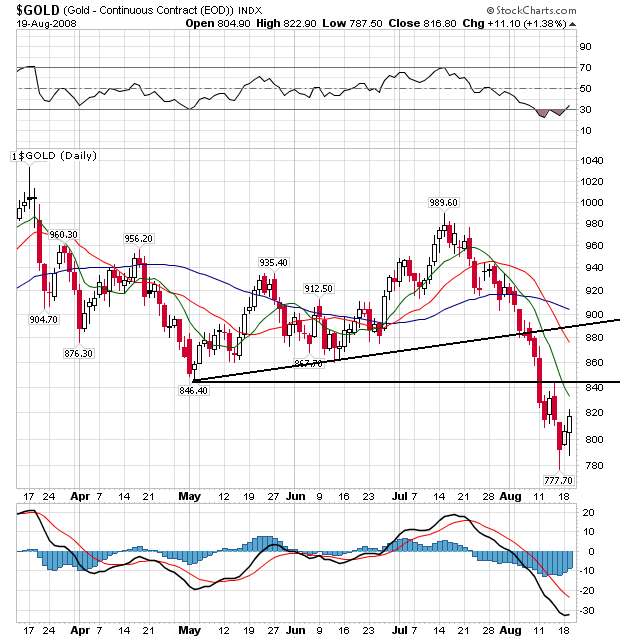
On the daily chart, notice the following:
-- Prices are below all the SMAs
-- All the SMAs are headed lower
-- The shorter SMAs are below the longer SMAs
-- Prices have broken two trend lines. The first is the upward sloping trend line that started at the beginning of May and the second is the low point from early May.
Bottom line: this is a chart that has changed directions, indicating inflation expectations are dropping.
This is big news. The gold market has been rallying for the last three years. However, we now see that gold has broken below the three year trend line. This signals a reversal of trend. Also note this is the most liberal trend line available -- the trend line that connects the lowest lows of the last three years. Using a trend line that connects more of the bottoms yields this result:
In other words, no matter how you slice it, the trend has been changed.
On the daily chart, notice the following:
-- Prices are below all the SMAs
-- All the SMAs are headed lower
-- The shorter SMAs are below the longer SMAs
-- Prices have broken two trend lines. The first is the upward sloping trend line that started at the beginning of May and the second is the low point from early May.
Bottom line: this is a chart that has changed directions, indicating inflation expectations are dropping.
Subscribe to:
Posts
(Atom)
